
Understanding Flexbox : Aligning and Distributing Items Easily
Discover Essential CSS Skill


While visiting different websites have you ever notice some websites have pictures aligned in single row and column . Do you ever think, how this type of beautiful and attractive designs are created ? Well, if yes them this article is for you. In this article we are going to learn the one of the most important and popular concept FLEXBOX!. So, without wasting time further let’s start!
What is CSS Flexbox ?
Flexbox short for Flexible Box Layout Model, is a layout model that is that is used to arrange items in rows and columns. It is basically a layout model for arranging items in a container in single dimension.
It aims to provide better way to layout, align and distribute space among items of a container. Flexbox makes it easier to design flexible responsive layout without using float or positioning.
To start using flexbox we need to first declare our container as a flexible container. The container become flexible by setting the display property to flex.

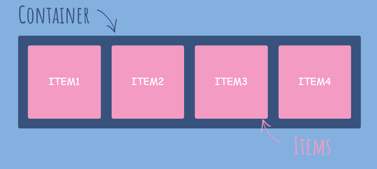
When your container become flexible there are basically two lines produced. Main axis from left to right and Cross axis from top to bottom. These are the lines along which our flexbox’s items are arranged. Our container after becoming flexbox will look like below:-

The main container ( parent container ) is also known as “flex container” and the items inside container also known as “children” or “flex items”.
Flexbox Properties
The properties are divided into two categories :
Properties for parent / flex-container
Properties for children/ flex-items
Let’s understand the properties for each one mentioned above.
Properties for Flex-container
1. flex-direction
flex-direction property is used to specify the display direction of flex items in container. The flex-direction property can have one of the following values.
row :- This is default value, and displays the items horizontally ( left to right ).
column :- This value displays the items from top to bottom. basically, when we do flex-direction: column it rotates the whole container vertically. \
row-reverse :- This value is same as row but from displays values from ( right to left ) .
column-reverse :- This value is same as column but displays the items form ( bottom to top ).

.container{
    display: flex;
    flex-direction: column;
}
2. flex-wrap
The flex wrap property specifies whether the flex items should wrap or not, if there is not enough space for them on one line. This property can take the following values
nowrap :- This is default value and all flex items are on single line.
wrap :- This value specifies that items will be wrap on multiple lines, from top to bottom if necessary.
wrap-reverse :- This value specifies that items will wrap in reverse order. ( bottom to top ).

.container{
    display: flex;
    flex-wrap: wrap;
}
3. justify-content
This property is used to align flex items along the main axis ( horizontally ). It helps to distribute extra free space leftover when either all the flex items on a line are inflexible, or are flexible but have reached their maximum size. This property can take the following values :
flex-start :- This value is default and this values align the flex items to the starting of the main axis ( leftmost side ).
flex-end :- This value align the flex items to the end of main axis ( rightmost side ).
center :- This value align this flex items in the center.
space-between :- This value put space between the flex-items.
space-around :- This value put space around the flex-items.
space-evenly :- This value put equal space in between and around the flex-items.

.container{
    display: flex;
    flex-wrap: wrap;
    justify-content: center;
}
4. align-items
The align-items property is used to arrange the flex-items ( vertically ) along the cross axis of the container. Think of it as the justify-content version for the cross-axis. This property can have the following values:
flex-start :- This value place the flex-items at the start of the cross axis ( at top ).
flex-end :- This value place the flex-items at the end of the cross axis ( at bottom ).
center :- This value place the flex-items at the center of the container.
stretch :- This value stretch the flex-items to fill container. This is default value.
baseline :- This value positions the flex items at the baseline of the container:

.container{
    display: flex;
    flex-wrap: wrap;
    align-items: center;
}
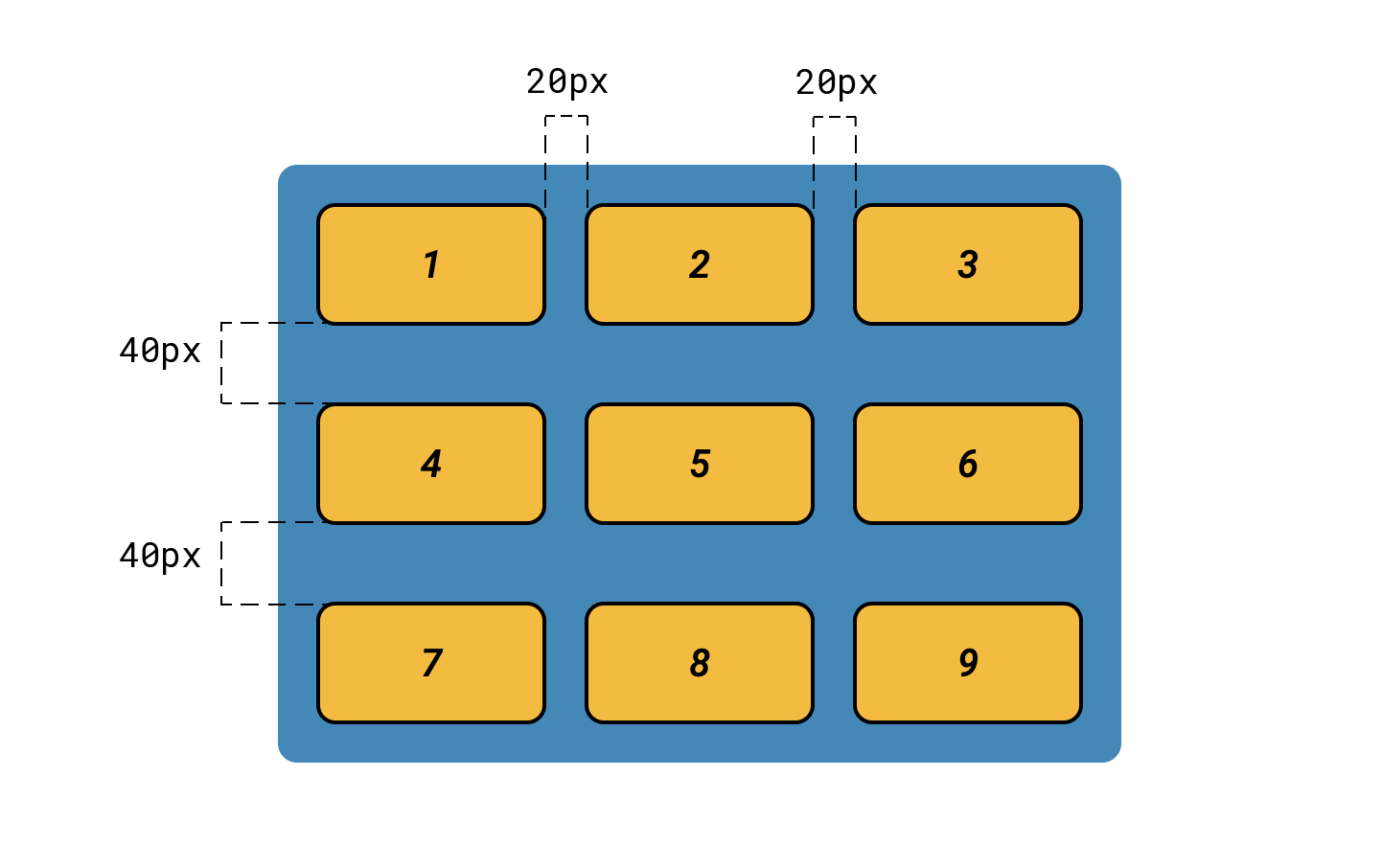
5. gap
The gap property is used to the put gap between the flex-items of the container. This property takes the number in pixels as value . he value is depend upon the user that how much gap he/she wanted.
6. flex-flow
The flex-flow property is a shorthand property for setting both the flex-direction and flex-wrap properties. if we have to use both flex-direction and flex-wrap then for convenient we use the flex-flow.
.container{
    display: flex;
    flex-flow: column wrap-reverse;
}
These are all the most commonly used properties of the flex container. Now, let’s see the properties of the flex-items.
Properties of flex-items
1. Order
The order property specifies the order of flex-items inside the flex container. The order property controls the order in which flex-items appears in container.
The default value of order for all items is 0. The higher the number the lower it’s order.

2. flex-grow
The flex-grow property how much a flex item will grow itself relative to other items if necessary. It dictates what amount of the available space inside the flex container the item should take up.
If all items have flex-grow set to 1, the remaining space in the container will be distributed equally to all children. If one of the children has a value of 2, that child would take up twice as much of the space as either one of the others (or it will try, at least).

.item1{
    order: 1;
    flex-grow: 2;
}
3. flex-shrink
The flex-shrink property specifies how much a flex item will shrink relative to other flex-items if necessary. It’s default value is 1.
.item1{
    flex-shrink: 2;
}
4. flex-basis
The flex-basis property is used to define the default or you can say initial length of an flex-item. It’s default value is set to auto. for example if there are three items inside the container with default width is 100px and i set the flex-basis of item2 to 200px then, item2 become large in size than relative flex-items.

.item2{
    flex-basis: 200px;
}
5. flex
This flex property is the shorthand for flex-grow, flex-shrink and flex-basis combined. The second and third parameters (flex-shrink and flex-basis) are optional. The default is 0 1 auto, but if you set it with a single number value, like : flex: 5;, that changes the flex-basis to 0%, so it’s like setting flex-grow: 5; flex-shrink: 1; flex-basis: 0%;.
.item2{
    flex: 5;
}
6. align-self
The align-self property is used to specify the alignment of the individual flex-item inside the flex-container. The align-self property overrides the default alignment set by the container's align-items property.
For example; let’s say all the items are at the start and then i give align-self: center; property to item3 then,item3 individually move to center of the container.

.item2{
    align-self: center;
}
So, these are all the most commonly used properties of the flex - items.
Why do we need flexbox ?
We know that, flexbox is used to design the user interface and flexible responsive layouts. Before the development of flexbox, the developers rely on older CSS techniques like float or positioning to create the layout which is not responsive. These techniques or methods often required extra workaround and additional efforts to handle alignment, responsiveness, and spacing, which was very headache for the developers. but, after the development of flexbox this work become very easy and fast. Therefor, the flexbox layout is very important to cerate flexible designs with responsiveness.
Conclusion
So, flexbox is one of the best layout that is used to created the responsive interfaces of the web-application. Leaning flexbox, will help us to arrange card and no of elements on the web page. And, that’s it! I hope this article helps you to understand the flexbox concept. If yes! then, please like me article . Thankyou so much!